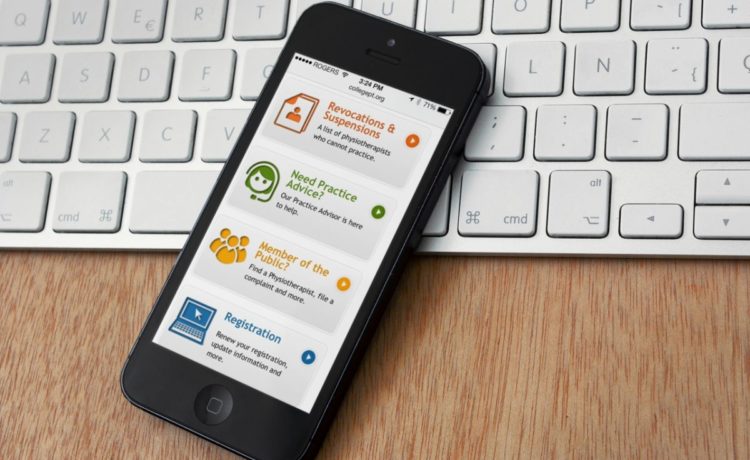
Usability is an area of website design that most companies have been aware of for many years now (with the odd anomaly that leaves us shaking our head), but as more and more people are using mobile devices not only for their leisure time but as an integral part of working on the go, the usability of mobile interfaces is becoming more of an issue for companies that want to stay ahead of the curve.
Operating systems
Of course, no one said that life was easy. Your website doesn’t just need to render text to a mobile device, it needs to be easily usable to potential customers on a huge variety of makes and models of mobile device. Even if you’re sure your site works on a particular operating system, it might not work on all the devices that an OS supports. An iOS user isn’t necessarily using an iPhone, for instance. They could be on an iPad, and your website is better if it can render successfully for both. You’ll also annoy iPad (or other tablet) users if you force them into using a mobile version of the site.
Having said that, it’s worth considering the needs of a mobile user who might appreciate features that cater specifically to them, such as a quick store locator or contact numbers that are easier to find and use. Users might give up if they can’t use your website easily, rather than bother to try later on a different device, if your competitor can be accessed this moment on their current device. Making their visit pleasant and easy wins you repeat visits.
The look of the thing
Once you’ve got your site working on all manner of mobile devices, you need to be sure your users can easily access the information they want from you, and the tone and information you want to get across to them too. If the font looks lovely on a large screen but dreadful on a smallone, that’s a problem. If your pages take too much scrolling through, or if your mobile users can’t access key (or any) useful information or features, they will move on to a competitor. That’s if they can even find you. Mobile sites have slightly different search engine rankings, and if you’re not easily findable then you’re missing out. Mobile screens can only hold so many results from a search engine. That screen size might work for or against you when visitors reach your site too. You have less room than on a desktop computer to grab the attention of a visitor.
There’s expert advice available if you need to read more about usability issues, and it will certainly be worth your while having your site checked by an expert before launching it to the general public.
Smartphones are used by an increasing percentage of internet users. As the phones have improved, so users expect more from the sites they’re accessing. Catering to the needs of a mobile user without subjecting them to an oversimplified or unusable site shouldn’t be difficult, and time spent on this at the beginning can save you hours later on.


